// PRS 3.0 surface — real marketing copy, image slideshow, 🍅 logo
const { useState: useSt, useEffect: useEf } = React;
const useIsMobile = window.useIsMobile;
// ── Lightbox ─────────────────────────────────────────────────────────────
function Lightbox({ images, startIndex, onClose }) {
const [idx, setIdx] = useSt(startIndex);
const [zoom, setZoom] = useSt(1);
const [pan, setPan] = useSt({ x: 0, y: 0 });
const [dragging, setDragging] = useSt(false);
const dragStart = React.useRef({ x: 0, y: 0, panX: 0, panY: 0 });
const resetPan = () => setPan({ x: 0, y: 0 });
useEf(() => {
const onKey = (e) => {
if (e.key === "Escape") onClose();
if (e.key === "ArrowRight") { setZoom(1); resetPan(); setIdx(i => (i + 1) % images.length); }
if (e.key === "ArrowLeft") { setZoom(1); resetPan(); setIdx(i => (i - 1 + images.length) % images.length); }
};
window.addEventListener("keydown", onKey);
return () => window.removeEventListener("keydown", onKey);
}, [images.length]);
const prev = (e) => { e.stopPropagation(); setZoom(1); resetPan(); setIdx(i => (i - 1 + images.length) % images.length); };
const next = (e) => { e.stopPropagation(); setZoom(1); resetPan(); setIdx(i => (i + 1) % images.length); };
// Drag handlers (mouse)
const onPointerDown = (e) => {
if (zoom <= 1) return;
e.preventDefault();
setDragging(true);
dragStart.current = { x: e.clientX, y: e.clientY, panX: pan.x, panY: pan.y };
};
const onPointerMove = (e) => {
if (!dragging) return;
setPan({
x: dragStart.current.panX + (e.clientX - dragStart.current.x),
y: dragStart.current.panY + (e.clientY - dragStart.current.y),
});
};
const onPointerUp = () => setDragging(false);
useEf(() => {
if (dragging) {
window.addEventListener("pointermove", onPointerMove);
window.addEventListener("pointerup", onPointerUp);
return () => {
window.removeEventListener("pointermove", onPointerMove);
window.removeEventListener("pointerup", onPointerUp);
};
}
}, [dragging, pan]);
const btnStyle = (extra) => ({
background: "rgba(255,255,255,0.15)", backdropFilter: "blur(8px)",
border: "1px solid rgba(255,255,255,0.22)", borderRadius: "50%",
width: 48, height: 48, display: "flex", alignItems: "center", justifyContent: "center",
cursor: "pointer", color: "#fff", fontSize: 22, fontWeight: 300, ...extra,
});
return (
{/* Image */}
e.stopPropagation()}
onPointerDown={onPointerDown}
style={{
transition: dragging ? "none" : "transform 200ms ease",
transform: `scale(${zoom}) translate(${pan.x / zoom}px, ${pan.y / zoom}px)`,
display: "flex", alignItems: "center", justifyContent: "center",
cursor: zoom > 1 ? (dragging ? "grabbing" : "grab") : "default",
touchAction: "none",
}}>

{/* Prev / Next */}
{images.length > 1 && (
)}
{images.length > 1 && (
)}
{/* Top-right controls */}
e.stopPropagation()} style={{ position: "fixed", top: 16, right: 16, display: "flex", gap: 8 }}>
{[
{ label: "+", action: () => setZoom(z => Math.min(z + 0.25, 3)) },
{ label: "−", action: () => { const nz = Math.max(zoom - 0.25, 0.5); setZoom(nz); if (nz <= 1) resetPan(); } },
{ label: "✕", action: onClose },
].map(({ label, action }) => (
))}
{/* Counter */}
{images.length > 1 && (
{idx + 1} / {images.length}
)}
onImageClick && onImageClick(i)}
style={{ position: "relative", width: "100%", aspectRatio: ratio, borderRadius: 20, border: "1px solid var(--border)", background: "var(--bg-muted)", overflow: "hidden", cursor: "zoom-in" }}>
{images.map((src, idx) => (

))}
e.stopPropagation()}
style={{ position: "absolute", bottom: 12, left: "50%", transform: "translateX(-50%)", display: "flex", gap: 6, zIndex: 2 }}>
{images.map((_, idx) => (
setHov(true)} onMouseLeave={() => setHov(false)}
style={{ background: "var(--bg-muted)", borderLeft: "1px solid var(--border)", padding: 12,
display: "flex", alignItems: "center", justifyContent: "center", cursor: "zoom-in", overflow: "hidden" }}>
setH(true)} onMouseLeave={() => setH(false)}
style={{
borderRadius: 20, border: "1px solid var(--border)",
background: h ? "var(--brand-primary)" : "var(--bg-muted)",
padding: 24, transition: "all 200ms ease", cursor: "default",
}}>
{x}
setH(true)} onMouseLeave={() => setH(false)}
style={{
background: h ? "var(--brand-primary)" : "#fff",
border: "1px solid var(--border)", borderRadius: 20, padding: 24,
transition: "all 200ms ease", cursor: "default",
}}>
{n}
{r}
🍅
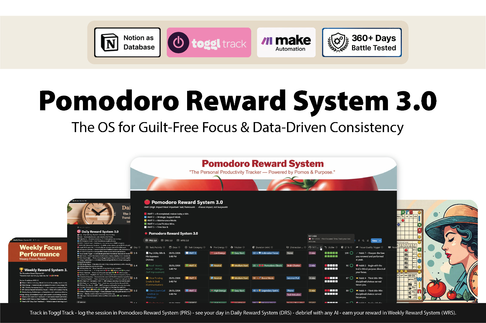
Pomodoro Reward System 3.0
$5 · one-time · lifetime updates
Track the truth.
Earn your freedom.
Claim your reward.
A Notion-based productivity OS built for deep work and absolute focus. 360+ days battle-tested. Zero data collection. Runs entirely on free tools.
{["360+ days tested", "No subscriptions", "20-minute setup"].map(s => (
{s}
))}
{[
{ icon:
, text: "Zero data collection" },
{ icon: , text: "Runs on free tools" },
{ icon: , text: "ADHD-friendly" }
].map(c => (
{c.text}
))}
{/* ── Three Connected Systems ── */}
{exp.map(c => {
const I = c.Icon;
return (
openLightbox(c.images, idx)}/>
{c.text}
);
})}
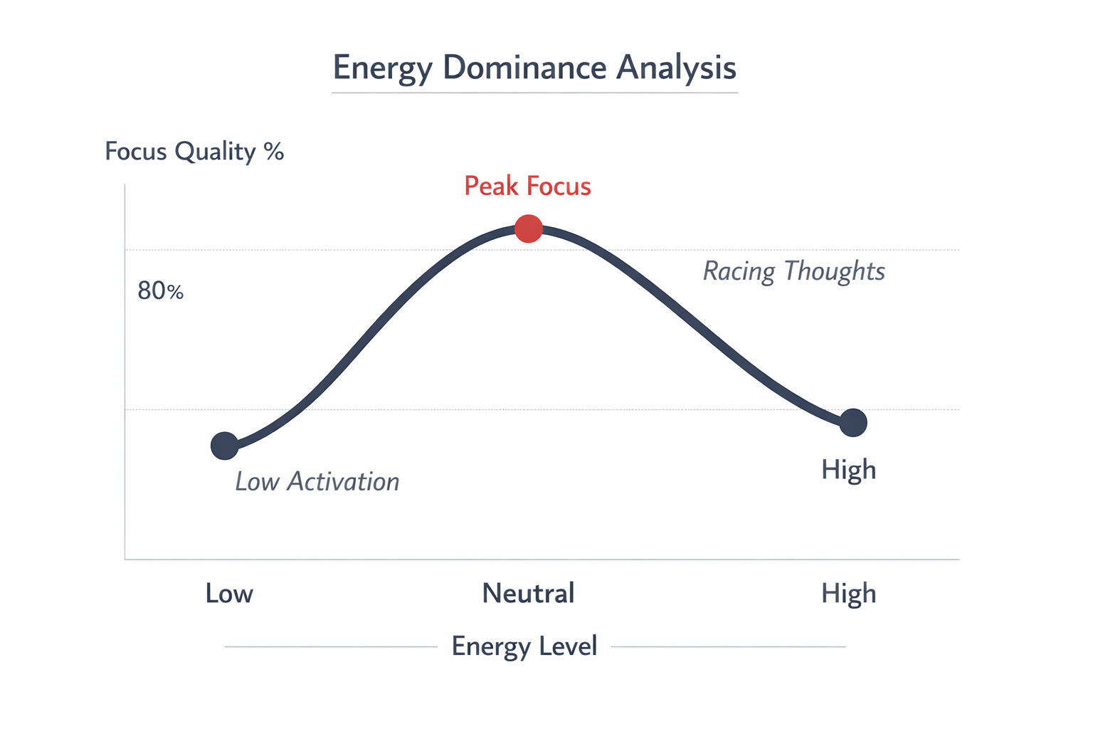
{[
{ n: "HMIT 1", c: "#e63946", t: "Moves the needle", d: "Direct work on your top goal. The stuff that, if missed for a week, costs you weeks of progress." },
{ n: "HMIT 2", c: "#0ea5e9", t: "Strategic support", d: "Work that enables HMIT 1. Planning, research, prep that makes the needle move easier." },
{ n: "HMIT 3", c: "#f59e0b", t: "Maintenance mode", d: "Things that have to happen — but don't grow anything. Email, admin, recurring chores." },
{ n: "HMIT 4", c: "#84cc16", t: "Low-friction wins", d: "Quick, easy, satisfying. Use to build momentum on a bad day, not to fill a good one." },
{ n: "HMIT 5", c: "#9ca3af", t: "Timebox or lose your day", d: "Browsing, doomscrolling, low-value rabbit holes. Allowed — only inside a hard time-box." },
].map(h => (
))}
Set the tier when you start the timer. Done.
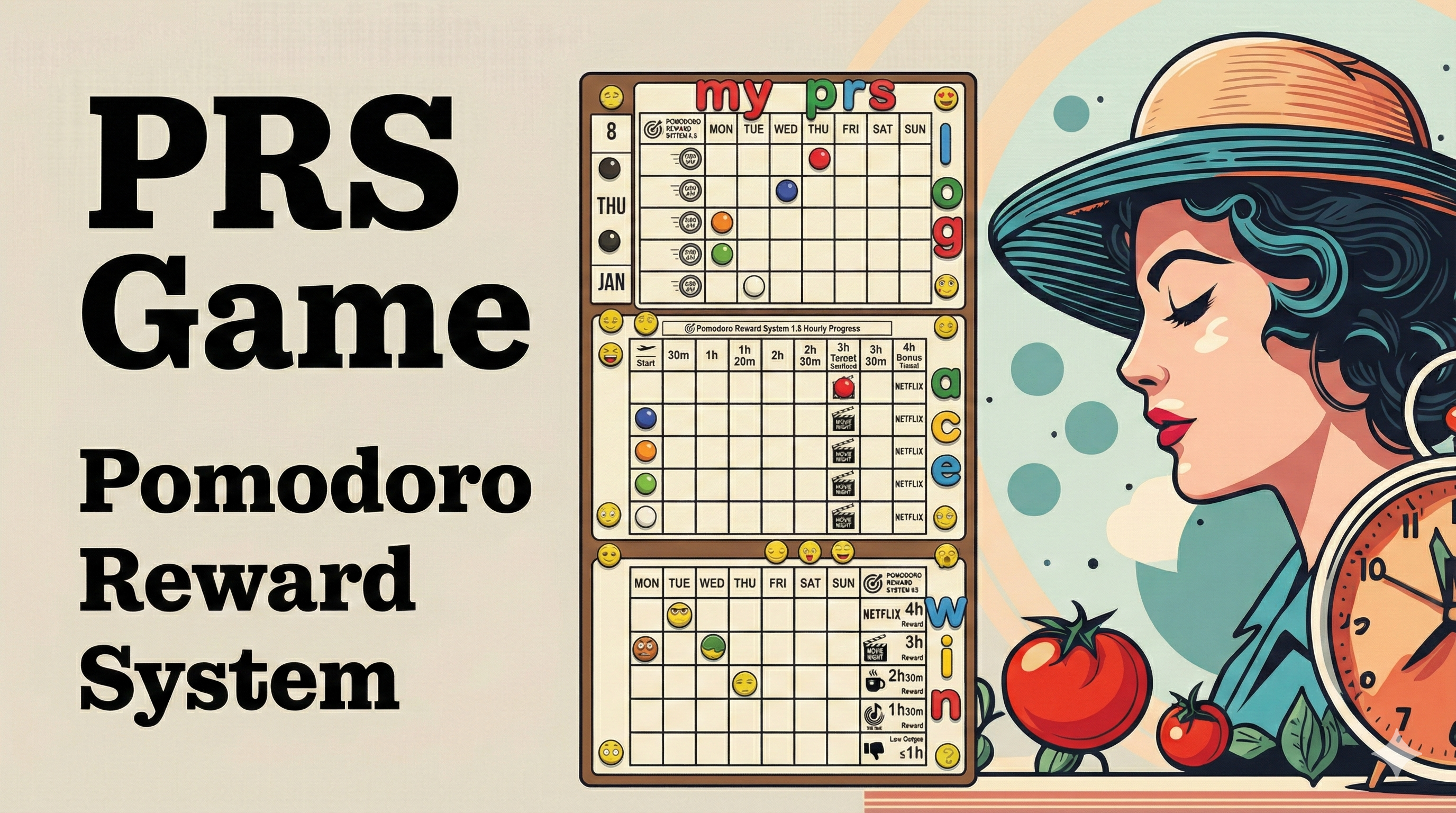
{/* ── PRS Game — same style as Priority Logic: SectionHead + 2-col (text left, image right) ── */}
{/* Left: feature list */}
{gameFeatures.map(c => {
const I = c.I;
return (
);
})}
{/* Right: whiteboard image */}
{[
{ n: "Notion", r: "Database & dashboards" },
{ n: "Toggl Track", r: "Pomodoro timer" },
{ n: "Make.com", r: "Automation glue" },
{ n: "Any AI", r: "Claude · ChatGPT · Gemini for debriefs" },
].map(t => )}
{/* ── Workflow ── */}
{workflowSteps.map((s, idx) => {
const imgSrc = `../../assets/workflow/${idx + 1}.png`;
return (
openLightbox([imgSrc], 0)}/>
);
})}
Five dollars. One system.
360+ days of evidence.
For people who already know what to do — and are tired of not doing it. One-time purchase, no subscription, no dashboard you have to maintain.
);
}
window.PrsSurface = PrsSurface;